So... blogger.com seems to not want to post my comments. >:P
Taylor C's:
I find it interesting that I almost always disagree with other art students when it comes to art. Although I like the third piece and think it's nicely done, it seems too... commercially. Like it's a computer graphic. It has great color, black lines, and the fact that's in the middle front and center makes it stand out and create a sound overall feeling to it. I think you should add something to the background, though, like some spaceships or gases leaking from the planet back there.
I like the last one best, but I think it's because it reminds me of a spray painted piece I saw once that used a similar style. It's cool nonetheless. Because of the large space towards the middle right, and how there's less space on the other side, it almost looks like a path. It feels like you're gliding along an invisible path through the stars and planets. :)
As for the second piece, I LOVE how they turned out, but you do need a different background or way to present them. I think it would be neat if you had a blue print kind of thing as the background.
Overall very nice, all of the pieces work with your concentration. Keep rockin'. :)
Allie M's:
I really love how you did the cards piece. The value and quality of the cards are done nicely and the simplicity of it really works. Although I think have it black and white is cool, I think that it should have a little bit of color, though. Like have the hearts colored in, that way you can put more emphasis on the 'Queen of Hearts' idea.
Not really digging the other piece. (the mushroom one) I like how bold you were with the colors, but it seems like it's all the same shade and there's not enough contrast. Maybe darkening the shadows as you go further and further back? I think the main mushroom that's covering half of the piece is a nice part of the piece, but it needs to contrast more with the other mushrooms in the front- maybe make the mushrooms in the front lighter? (adding to contrast) As for the Caterpillar-you said in the comment that you wanted to make him more noticeable- what if you make the perspective from his eyes? Like he's the one sitting under the mushroom gazing out at the other mushrooms?
Love your concentration and think it's awesome. :) (My middle name on facebook is 'futterwacken'. just a little side note.)
Lucas S's:
I enjoy your style and concentration theme. It's a bit darker than the other ones in the class, and I think it's cooler than just going with something clean and 'nice'. Your style is gross and awesome. :D
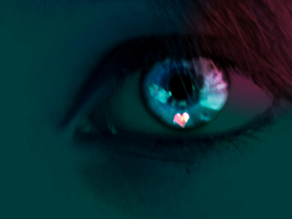
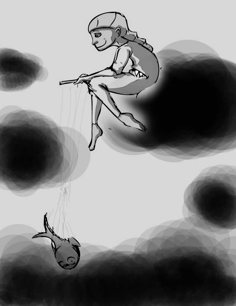
Any who, your pieces. I like the first one and how you don't show the jaw, neck or shoulders. The little color you used is nicely woven into the piece and not overused. It's difficult to read the quote, not sure how you'd fix that. Also, I think you could do without all the extra space. Like, the first photo is a close-up of it, and I find it easier to look at rather than floating awkwardly.
The other piece: I like the mixed textures/styles of it. The line quality is AWESOME. (I've seen a lot of artwork recently that kind of failed with it... so see art that the lines aren't messed up and bugging me is unusual) The only part about the piece that annoys me are the lines at the top from the eyes. It's not really necessary for the point, and although it makes it more 'face like' you have other pieces that you have random body parts floating around, so it wouldn't be odd. Overall both pieces work nicely with your theme.
Those are my two cents. Peace.
 Hotel California